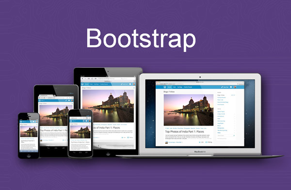
In today’s digital world, creating a responsive website is essential for ensuring that your site looks great and functions well across all devices, from desktop computers to smartphones and tablets. One of the most efficient ways to build a responsive website is by using Bootstrap, a powerful front-end framework that simplifies the design and development process. If you’re looking for a way to create a responsive website using Bootstrap, this guide will walk you through the essentials and provide you with the knowledge you need to build a professional, mobile-friendly website.
Whether you’re a beginner or a seasoned developer, this tutorial will help you understand how to use Bootstrap’s grid system, components, and utilities to create a website that adapts to different screen sizes.
What is Bootstrap?
Bootstrap is an open-source front-end framework developed by Twitter. It provides a set of CSS, JavaScript, and HTML components that help developers quickly design and customize websites. It is widely used for creating responsive web pages because it offers a mobile-first approach, ensuring that websites look good on both mobile devices and desktops.
Some key features of Bootstrap include:
A grid system that helps create flexible layouts.
Pre-built components like navigation bars, buttons, and forms.
JavaScript plugins for adding interactive elements like modals and carousels.
Customizable themes and styles.
Now that we understand what Bootstrap is, let’s dive into how to create a responsive website using Bootstrap.
How to Create a Responsive Website Using Bootstrap: Step 1 – Set Up Your Project
Before you start writing code, you need to set up your project folder. Follow these steps to create a basic structure:
Create a Project Folder: Start by creating a new folder on your computer. This folder will hold all your project files.
Download Bootstrap: You can either download Bootstrap locally or use a Content Delivery Network (CDN) to link to the latest version. For simplicity, we’ll use the CDN method. Add the following code in the
<head>section of your HTML file to include Bootstrap CSS:html<link href="https://cdn.jsdelivr.net/npm/[email protected]/dist/css/bootstrap.min.css" rel="stylesheet">
Then, include the Bootstrap JavaScript libraries before the closing
</body>tag:html<script src="https://cdn.jsdelivr.net/npm/[email protected]/dist/js/bootstrap.bundle.min.js"></script>
Create the Basic HTML Structure: Create a new HTML file (e.g.,
index.html) inside your project folder. The basic structure of the file will look like this:html<!DOCTYPE html>
<html lang="en">
<head>
<meta charset="UTF-8">
<meta name="viewport" content="width=device-width, initial-scale=1.0">
<title>Responsive Website Using Bootstrap</title>
<link href="https://cdn.jsdelivr.net/npm/[email protected]/dist/css/bootstrap.min.css" rel="stylesheet">
</head>
<body>
<!-- Content will go here -->
<script src="https://cdn.jsdelivr.net/npm/[email protected]/dist/js/bootstrap.bundle.min.js"></script>
</body>
</html>
The meta viewport tag ensures that your site is responsive on all devices. Now, you’re ready to start building your responsive website.
How to Create a Responsive Website Using Bootstrap: Step 2 – Using the Grid System
One of the most powerful tools in Bootstrap is its grid system, which allows you to create flexible, responsive layouts. The grid system is based on 12 columns, and you can specify how many columns each element should span.
Create a Container: To get started, you need to wrap your content in a container. A container ensures that your content is properly aligned. Use the following code to create a container:
html<div class="container">
<!-- Your content will go here -->
</div>
Create Rows and Columns: Inside the container, you’ll create rows and columns. Rows are used to hold columns, and columns will contain your actual content. Here’s an example:
html<div class="container">
<div class="row">
<div class="col-md-4">
<div class="bg-light p-3">Column 1</div>
</div>
<div class="col-md-4">
<div class="bg-light p-3">Column 2</div>
</div>
<div class="col-md-4">
<div class="bg-light p-3">Column 3</div>
</div>
</div>
</div>
In this example:
The
containerclass wraps the content.The
rowclass is used to create a horizontal row of columns.The
col-md-4class means each column will take up 4 out of the 12 columns on medium-sized screens (≥768px).
You can adjust the column sizes based on the device. For example,
col-sm-6will span 6 columns on small screens, andcol-lg-3will span 3 columns on large screens.Responsive Layouts: The key to making your website responsive is to adjust the column widths based on different screen sizes. Bootstrap uses responsive classes that change the number of columns depending on the screen width. For example:
html<div class="container">
<div class="row">
<div class="col-12 col-md-6 col-lg-4">
Column 1
</div>
<div class="col-12 col-md-6 col-lg-4">
Column 2
</div>
<div class="col-12 col-md-6 col-lg-4">
Column 3
</div>
</div>
</div>
In this example:
On extra small screens (
col-12), each column will take up the full width.On medium screens (
col-md-6), each column will take up half the width.On large screens (
col-lg-4), each column will take up one-third of the width.
This flexibility allows you to create a layout that adapts to all screen sizes, from mobile phones to large desktop monitors.
How to Create a Responsive Website Using Bootstrap: Step 3 – Adding Components
Bootstrap comes with a variety of pre-built components that can be easily integrated into your website. These include navigation bars, buttons, cards, modals, and more. Let’s look at how to add some of these components.
Navigation Bar: A responsive navigation bar that adapts to different screen sizes is easy to create with Bootstrap. Here’s a simple example:
html<nav class="navbar navbar-expand-lg navbar-light bg-light">
<a class="navbar-brand" href="#">My Website</a>
<button class="navbar-toggler" type="button" data-bs-toggle="collapse" data-bs-target="#navbarNav" aria-controls="navbarNav" aria-expanded="false" aria-label="Toggle navigation">
<span class="navbar-toggler-icon"></span>
</button>
<div class="collapse navbar-collapse" id="navbarNav">
<ul class="navbar-nav">
<li class="nav-item active">
<a class="nav-link" href="#">Home</a>
</li>
<li class="nav-item">
<a class="nav-link" href="#">About</a>
</li>
<li class="nav-item">
<a class="nav-link" href="#">Services</a>
</li>
<li class="nav-item">
<a class="nav-link" href="#">Contact</a>
</li>
</ul>
</div>
</nav>
This navigation bar will collapse into a hamburger menu on smaller screens, making it mobile-friendly.
Cards: Bootstrap cards are flexible and can be used to display content in a grid layout. Here’s an example of a card component:
html<div class="card" style="width: 18rem;">
<img src="https://via.placeholder.com/150" class="card-img-top" alt="...">
<div class="card-body">
<h5 class="card-title">Card Title</h5>
<p class="card-text">Some quick example text to build on the card title and make up the bulk of the card's content.</p>
<a href="#" class="btn btn-primary">Go somewhere</a>
</div>
</div>
How to Create a Responsive Website Using Bootstrap: Step 4 – Customize and Style Your Website
Once you’ve laid out the basic structure using Bootstrap’s grid system and components, you can further customize the design with your own styles. You can override Bootstrap’s default styles by adding your own CSS in a <style> block or in an external CSS file.
For example, to change the background color of the navigation bar, you can add the following CSS:
.navbar {

background-color: #4CAF50;

}
This simple addition will customize the navbar to have a green background.
Conclusion
Learning how to create a responsive website using Bootstrap is a valuable skill for web developers. With its easy-to-use grid system and pre-built components, Bootstrap makes building responsive websites faster and more efficient. By following the steps in this guide, you can create a website that looks great on any device, whether it’s a smartphone, tablet, or desktop.